75 x 100mm. 60g copy paper
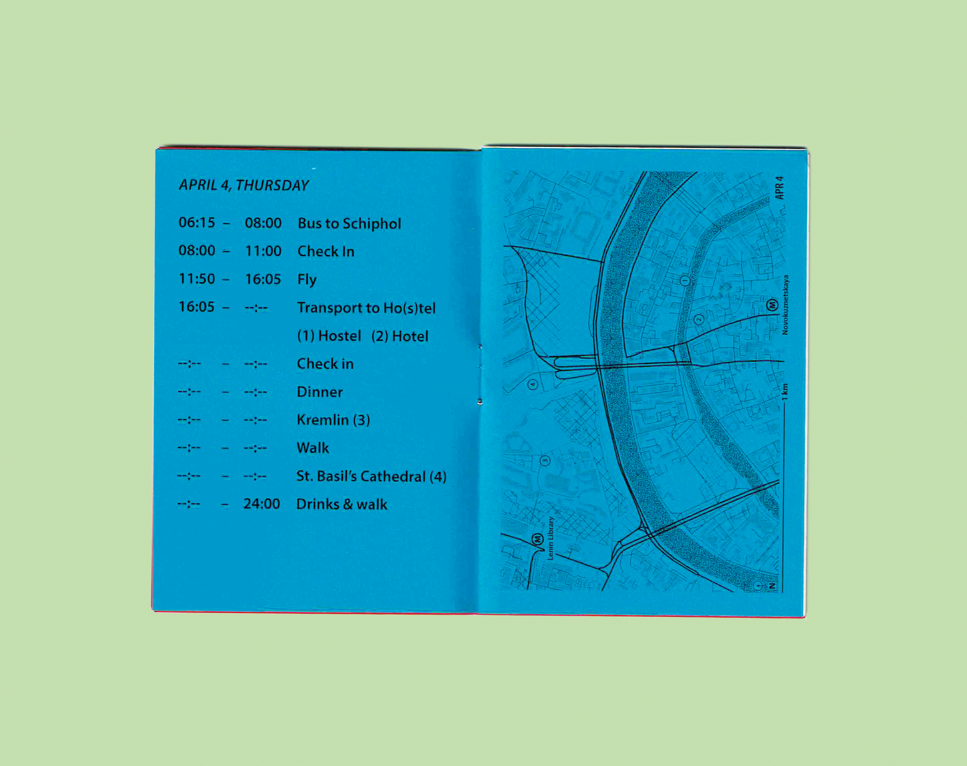
For the Information Design Department's excursion to Moscow in May 2019 I designed, printed, and folded these programs. These hand sized booklets contain the schedule (with special markings next to mandatory things), information for the hostel the students stayed in and the hotel the tutors stayed in, as well as helpful phrases and the cyrilic alphabet and numbers.
For each day I created a custom map that had the relevant locations as well as the closest Metro stops. Four of the day maps form the red front cover of the program. The entire cover unfolds to show a greater map of Moscow inside with the day maps clearly marked to give an overview of the places we visited.

A3 (Tabloid), Risoprint
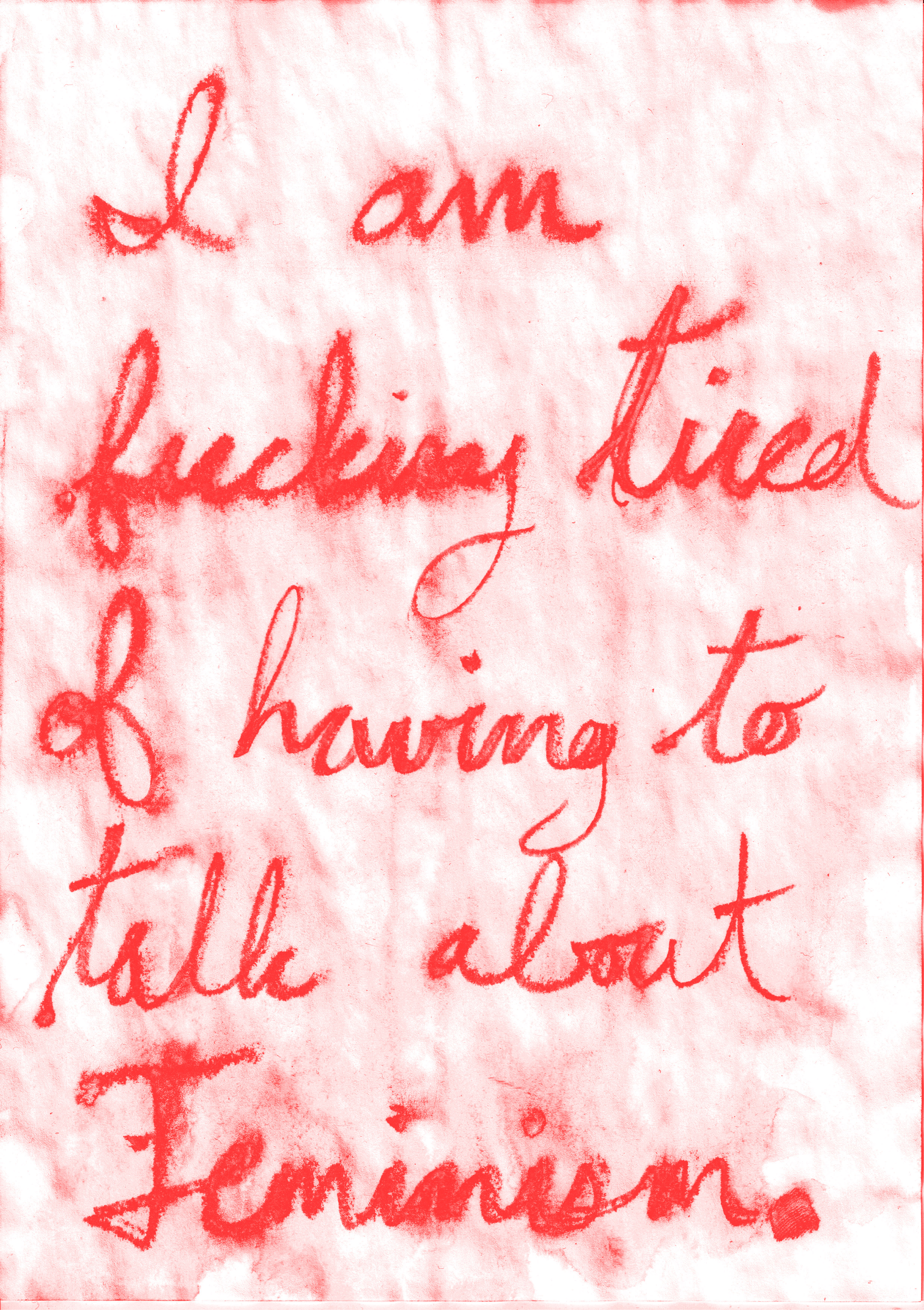
This three poster series began as a short workshop run by Delphine Bedel at the Design Academy Eindhoven. The focus of the workshop was "Feminism" in broad strokes and our groups were tasked with choosing a related topic, conducting in depth research, and condensing it into a single or double sided poster/zine.
The first meetings included the whole class of twenty people and would very quickly become debates about whether feminism should be an important thing at all given that the current climate appears so equal from the surface (which is how it was put by one of my fellow classmates).
My teammates were Fenna Wenselar, Domitille Debret and although we deeply felt that equality is important and sexism is still very much an issue (especially when it is subtle) we began talking about how exhausting it was to have to continue trying to convince people of its importance. And we were exhausted by having to continually work on projects whose focus was broad feminism for feminism's sake.
Working within this theme, we spent our time reading articles on feminism fatigue and discussing how even if we were tired it was not an option to stop talking about and fighting for what we believe. This paradox informs every design choice made for this poster. The writing is strong, urgent, yet carefully written. It is worn like the arguments and discussions. Worn by the amount of time the same discussions have been happening with little progress. We chose to keep it as a poster and not a zine so that in its ideal form it could be printed ad infinitum and plastered everywhere. A marker, a call, to continue the fight even when you are exhausted, even when you are tired of the same old fights.
Being tired of the same old same old should not push us to stop working, it should push us to find new solutions.