A Critique of the Representation of Quantum Gravity
Gijs Bakker Award Winner
Masters Thesis
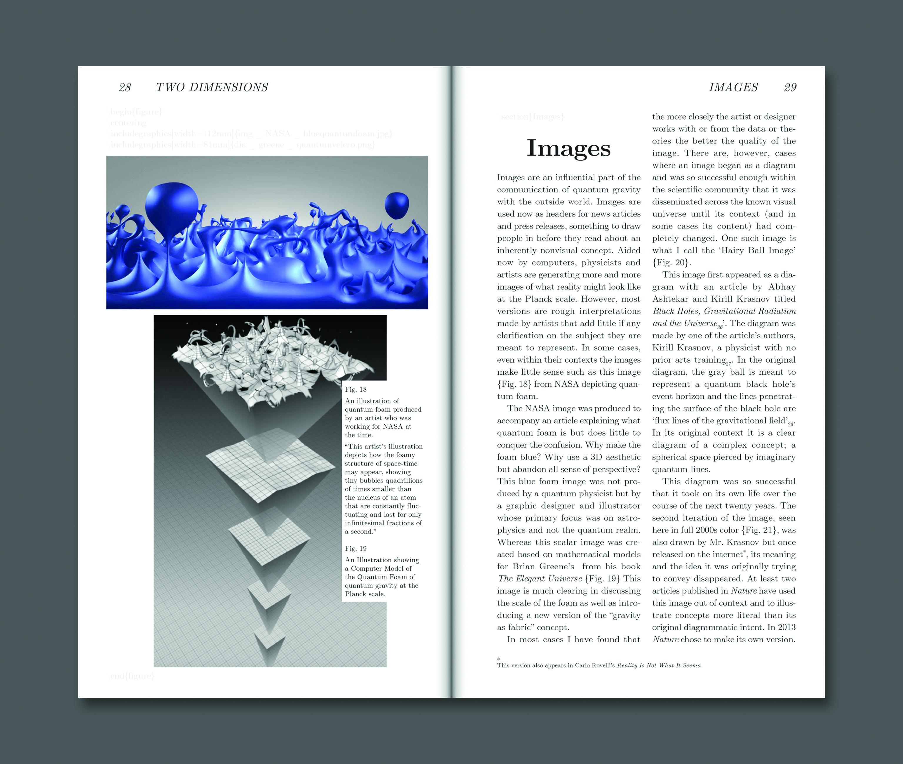
This work began by questioning why quantum gravity is so misrepresented to the interested public. Outside of the math very little is consistent. The writing is exclusionary and relies heavily on paradoxical thought experiments that are never quite fully explained. The diagrams are over simplified and do not make sense outside of their contexts. In some cases they are ripped from their contexts and used as illustrations in articles far from what they were originally meant to clarify. The imagery is confusing and misleading and typically does not add more to an understanding of the subject.
Given that quantum gravity is so important to the future of physics and could hold the answer to joining General Relativity with the Standard Model it is especially sad that it is so poorly represented.
Part I of this work addresses the current representations of quantum gravity and discusses historical influences all the while critiquing their lack of criticality in design and representation. It also addresses the strengths and weaknesses of certain mediums and formats to communicate the complexities of quantum gravity.
Part II focuses on my work to remedy the situation. I show my physical experiments and discuss why they worked or didn’t and how people reacted to them. Part II is meant to act as a documentation of my experimentation in representing quantum gravity and therefore presents my successes and failures.
Given the highly conceptual and theoretical nature of quantum gravity it is reasonable to ask if a perfectly accurate depiction is even possible. I argue that it is the role of the designer that we try and continue to strive for clarity in how we represent physics to the interested public no matter how fuzzy the conclusions or concepts.
“If anybody says he can think about quantum theory without getting giddy, it merely shows that he hasn’t understood the first thing about it!”
Niels Bohr
Nobel Prize winning Physicist
As quoted by Otto R. Frisch in What Little I Remember (1979)